HealthyHive’s latest #HSAhack
The more we examine our gigabytes of healthcare claims data, the more we learn. And the more our heads ache. We’ve learned one lesson again and again: communicate findings without losing the reader in under 20 seconds. It’s a difficult task because there is no Cliff Notes for Data Science for Open Healthcare Data. The stakes are high given our goal is to use data-driven insights to help consumers save money in their HSA.
Location Matters
In today’s #HSAhack, we cover an example of why ‘Place of Service’ is an important factor for consumers enrolled in high deductible healthcare plans (HDHP). Why should our readers care about where they receive healthcare services? It’s simple: money not spent in an HSA today is money that can be spent later … especially in retirement. It’s a new mindset — we agree. But consumers are finally becoming more compelled by what their HSA can do for them. Savvy HealthyHive customers are already learning the tricks of the trade for the best #HSAhacks.
The Service
Our example service comprises over 12,700 claims of a procedure associated with high out-of-pocket costs for a 50 year-old female. The average cost of this service was $285.47. Looking at averages, however, can be dangerous. Let’s see why.
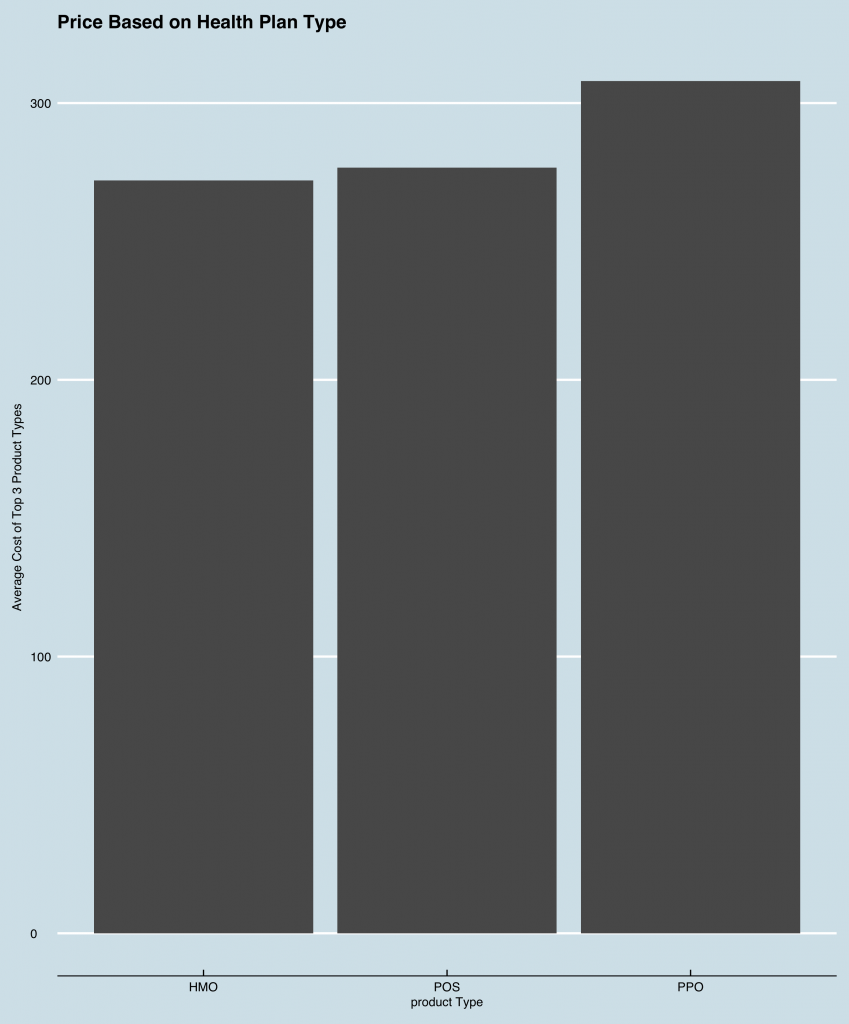
Product Type?
Suppose we wanted to see if the average cost varied a lot based on insurance product type, like HMO vs. PPO? Is this insightful?

Interesting – the average total cost for PPO plans is the highest. But it is by no means an order of magnitude higher.
Geographical Location?
What about geographical considerations? Are some people paying more based on the specific county they live in? Let’s take a look at the top 2 counties based on the number of times this service was rendered:

Neither set of patients living in counties ’11’ (Hillsborough) and ’15’ (Rockingham) appear to be suffering from a relative lack of “affordable” access.
Volume?
What does the provider volume picture look like? Below we see that the top 3 providers by volume for the service averages around 400 patient interactions over the time period. So these top 3 providers make up less than 10% of the overall volume across all providers in our particular study:

Looks like provider ‘156725’ has the most volume/market share for this particular service over the timeframe. How does ‘156725’s average cost look? One would expect a lower cost, but how much lower?

WOW. ‘156725’s average cost is LESS THAN HALF of ‘23856’. Don’t forget, each had similar volume. The low-cost provider billed less than half the amount as the provider with the second highest level of volume. Wouldn’t we expect to see the volume differential be much larger? What’s going on here?
Last, but not least, Location Type
Let’s take a look at one last average cost plot: ‘Location Type’ — or what type of setting is the service is being rendered:

Voila! When we started, we noted that the average cost was around $285.47. The real story comes only after a little digging. HOP stands for a ‘Hospital’ place of service and PHY stands for ‘Physician’s Office’. HOP settings are twice as expensive in this example. HSA dollars are not Monopoly money. We often treat flexible spending arrangement (FSA) balances at the end of the year like Monopoly money — “I think I will purchase 3 cases of sunblock for the next year so I don’t waste my FSA savings” — the struggle is real. But HSA dollars are dollars that can be spent next week, next year, or or 2 decades from today.
Conclusion
Before you go for any elective healthcare service, be sure to request a ‘Physician’s Office Setting’ and not a ‘Hospital’ setting. In short, when you step into a hospital you will most likely incur a facility fee. Don’t try to make sense out of it, because there is no sense to be made. Just be sure to make it clear to your Primary Care Physician or other referring provider: you’re a healthcare Ninja and hacking HSAs is your past time.
Let us know which services you’re interested in learning more about!
#HSAhack

Comments are closed.